Top 25 Drugs Analysis
CHALLENGE
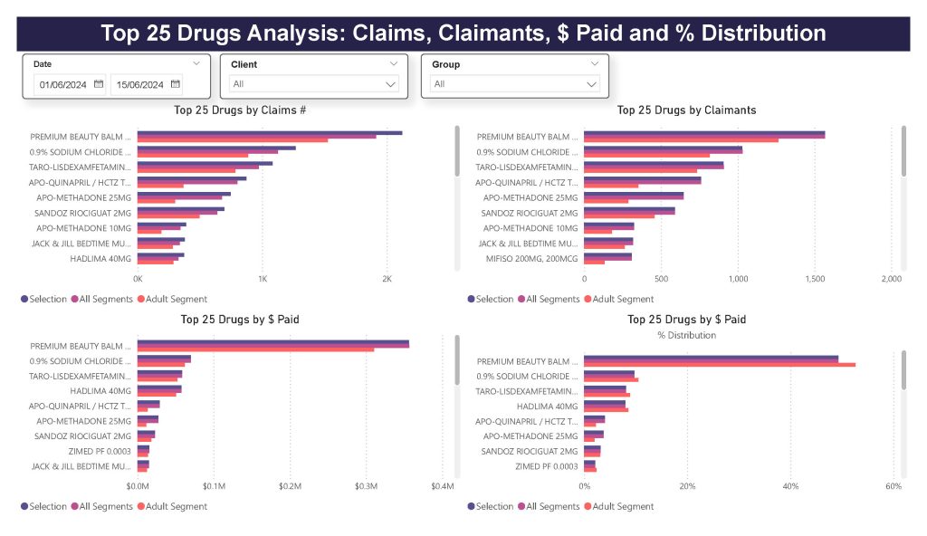
Stakeholders needed a visual, easy-to-update report showing key insights on drug claims, claimants, total paid amounts, and percentage distribution by drug. Clients with multiple groups would also like to filter by groups. The data was pulled from a SQL-based system and is set to refresh every two weeks.
SOLUTION
I created a Power BI dashboard that visualizes the top 25 drugs by claims, claimants, paid amount, and % distribution. Users can filter data by date range, client ID, and group, with dynamic views for different age groups. The dashboard automatically refreshes bi-weekly, providing up-to-date insights and helping decision-makers track trends and performance effectively.
TOOLS & TECHNOLOGIES USED
Power BI, SQL

FEATURED PROJECTS
Report Automation for Health Claims Adjudication
Python, SQL, Excel
Campaign Success Analysis Presentation – EduShare
Power BI, PowerPoint
Performance Analysis Dashboard in
Power BI
Power BI, Microsoft SQL
California Housing Prices
Python, Jupyter Notebook, Kaggle